Professional and Technical Writing/Design/Charts
< Professional and Technical Writing < DesignCharts and Graphs
Graphs and charts serve as a form of communication in many business settings. Since many businesses travel internationally language barriers often result, causing frustrations between businesses. Graphs and charts are used as a form of wordless communication to facilitate conversations, instructions, and directions. Graphs and charts can be used to convey important information, such as numeric quantities, trends and relationships between values. It is important to choose the right type of graph or chart to easily and accurately convey information. Make sure you define the graph or chart, give an explanation of the graph or chart in addition to choosing one that is easily read that conveys your information accurately.
When using a chart or graph, a key and title are essential for the reader to understand what the chart or graph is representing. Typically a chart is graphical, containing very little text. It has been proven that people are able to understand and process information better when it is presented in a graphical format, rather than in text. Using charts with accurate information in persuasive ways can help to engage your audience and get your point across clearly and resourcefully.
Scatter Plots
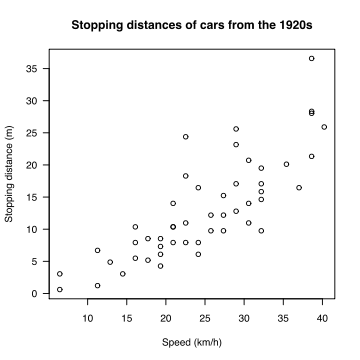 An example of a scatter plot. |
Scatter plots are good way to display the values of two variables for a set of data. This means that for each separate point of data on the graph, there are two separate pieces of data, an independent and dependent variable, that determine the location of the point. The independent or controlled variable is usually on the horizontal axis. The dependent variable is then measured and placed on the vertical axis. A scatter plot is not good for measuring multiple sets of data.
Main things to be included in a scatter plot are as follows:
- Title: Most important thing (what is a chart without a title). Must be to the point.
- X-axis (Horizontal) and Y-axis (Vertical): Both axis should be labeled and provide units of measurement.
- Points: The data points should be placed on the graph according to the experimental outcomes independent and dependent variables.
- R squared value: Used to sense trends and correlation of the data.
- Equations: Any equation that my help a reader interpret the data more clearly.
- Trend Line: Shows if the data has a trend and can also show outliers and how well correlated the data is.
Example: x = 3 and Y = 5 would be graphed (3, 5) on the scatter plot.
Line Graphs
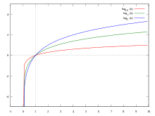 An example of a comparative line graph. |
Line graphs are a good way to compare anything between two or more variables. These are one of the easier types of graphs to look at because you can clearly see the changes in the line as time goes on. A line graph should never be used to show statistics at a set moment in time. A disadvantage of line graphs is it can be difficult to see exactly what number is being specified at a data point. If it is important that the numbers be easily read, they may be inserted within the graph at their respective data points. Since most line graphs are used to convey a trend over time, however, specific numbers are not always necessary.
Main things to be included in a line graph are as follows:
- Title: The most important thing (what is a chart without a title). Must be to the point.
- X-axis (Horizontal) and Y-axis (Vertical): Both axes should be labeled and provide units of measurement. They should extend slightly past the highest graphed value.
- Tick Marks: Use tick marks on both axes to show units. Make sure they are not cluttering the graph.
- Line: The line shows the actual data being displayed. It can be displayed as a single data point, data points with a line connecting the points, or as a single smooth line with no data points. Different colors can also be used to designate various elements.
- Source: Should be included if the source will not be obvious to readers.
Tips for making line graphs:
- Use different colors to ensure that the reader can distinguish between the lines. If you cannot use different colors, use different types of lines, for example, dots or dashes.
- If possible, start axes at zero to avoid misleading readers. If this is not possible, use hash marks to inform your readers that your graph does not start at zero.
Bar Graphs
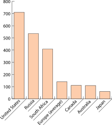 An example of a bar graph. |
Bar graphs can be used as a simple and easy way to compare quantities. The bars can extend up from the base of the graph, or extend horizontally from the sides of the graph. Bar graphs work best when comparing quantities over time and give a better visual when the changes are rather large. Main things to be included in a bar graph are as follows:
- Title: This is the most important thing. Make sure to give a title that readers will easily understand and that will successfully convey the information that is contained in the bar graph.
- X-axis (Horizontal) and Y-axis (Vertical): Both axes should be labeled and provide units of measurement.
- Bars: This is what shows the actual data being displayed. The bars start at zero and extend to the value which is necessary. Appropriate colors and a key should be used if multiple bars could be used to simplify the reading process. The bars can be touching or separate, depending on space and preference.
- Labels: Label every piece of data so it is clear what each bar in the graph represents. It is important to do so, in order to promote clarity and usability of the graph.
- Source: This should be included if it will not be obvious to readers.
- Key: When bars are repeated, include a key of the colors, or place labels next to each bar to clarify what they represent.
Tips for creating bar graphs:
- Arrange bars in an order that readers will find most helpful. They could be arranged alphabetically, chronologically, from longest to shortest, or vice versa.
- If possible, begin bars at zero. If this is not possible, use hash marks to inform your readers the bars do not start at zero.
Pie Charts
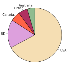 An example of a pie chart. |
Pie charts are effective for showing pieces of information that have a direct correlation to one another. Pie charts are one of the most commonly used graphics to communicate varying values or percentages in relation to each other. However, they are not useful for demonstrating changes over time. They only show parts of a whole at a specific moment in time.
The chart is made up of a circle that contains many "slices" representing values in percentages or magnitudes that add up to a whole circle, or 100%. These are used in the business world, but are rarely used in technical or scientific reports because of their inability to communicate differences between the slices of the pie, as well as the inability to compare multiple pie charts to each other. The main things to be included in a pie chart are the following:
- Title-Most important piece of information.
- Labeling on all sections of the pie (including percentages).
-A legend could also be used to inform the reader of the set of data being compared.
- Use Color, it makes the chart more visually attractive and may help distinguish between slices of the chart. Color coding and a legend may also be used if the slices are to small to be labeled individually, of if you do not want to label the slices individually.
Other charts
Organization charts
- Note that the purpose of an organization chart is to map the various divisions and levels of responsibility within an organization.
- Make the chart as simple as the organization itself, with the levels of hierarchy organized highest to lowest and positioned on the chart from top to bottom. The more levels of hierarchy in the organization, the more vertical the chart; the more divisions in the organization, the more horizontal the chart.
- Use the same shape in the same size for all divisions of the organization that are at the same level in the hierarchy.
- Label each division of the organization.
- If space allows, put the labels directly on the division; if not, attach the label to the subject with thin rules (never arrows).
- Position all the labels on the horizontal so that the view doesn't have to rotate the page or screen to read the labels.
- Connect each level of the organization to the higher and lower levels with a clear line (never arrows).
- Connect optional, informal, or temporary relationships with a dotted line.
Flow charts
- Note that the purpose of a flow chart is to show the sequence of steps in a process or procedure.
- Make the flow chart as simple as the process itself. If a process is simple, design the flow chart so that it progresses in a single direction, usually top to bottom or left to right. Complicated designs that spiral and zigzag imply a more complicated process.
- Use the same shape in the same size for all equivalent steps or phases, but different shapes for steps or phases of a different kind (e.g., circles for the stages in researching a document, squares for the stages of writing, and diamonds for the production stages of printing and binding).
- Label each of the steps or phases.
- If space allows, put the labels directly on the step; if not, attach the label to the step with thin rules (never arrows).
- Position all the labels on the horizontal so that the viewer doesn't have to rotate the page or screen to read the labels.
- Connect each step or phase in the sequence to the next step or phase with a clear directional arrow.
- Connect reversible or interactive steps or phases with double-headed arrows.
- Connect recursive or cyclical steps or phases with circular arrows.
- Connect optional steps or phases with dotted-line arrows.
Diagrams
- Note that the purpose of a diagram is to identify the parts of a subject and their spatial or functional relationship.
- Keep the diagram as simple as possible, avoiding unnecessary details or distracting decorations and focusing the viewer's attention on the key features or parts of the subject.
- Label each of the pertinent parts of the subject.
- If space allows, put the labels directly on the part; if not, attach the label to the part with thin rules (never arrows).
- Position all the labels on the horizontal so that the viewer doesn't have to rotate the page or screen to read the labels.
Pictographs
Pictographs are similar to bar graphs except, instead of bars, symbols are used in order to simplify the viewing process. Pictographs are not seen often in professional work. They can best be put to use in communicating with children or young adults that may not have adequate reading skills.
Main things to be included in a pictograph:
- Title: Most important thing
- Key: a key should be present in order to show the viewer how much each symbol represents. Each symbol should be as simple as possible. Color, size, or orientation can be varied to represent different items.
- For Example: A ticket stub could equal 2 movies watched. If the number the symbol is assigned to is simple, it can be cut in half in order to show fractions. For Example: Half of the ticket stub equals 1 movie watched.
The definition of a pictogram or pictograph is a symbol used to represent an object or place that is widely recognized and understood, sometimes even across cultures. This form of showing and representing information could be extremely useful when dealing with multiple cultures and languages. A common example of a pictogram is the man and woman symbols used to distinguish the woman's bathroom from the man's bathroom. These two symbols are recognized throughout the world and, in each situation, mean the same thing. So, a pictogram would be appropriate for communicating to a varied audience either of young children or people of many languages. The pictures and symbols along with a proper key will convey meaning without the necessity of words.